Clearer service pages
Rewrite and structure pages so visitors understand what you do, who you help, and why it matters.
Law Firm Website Design · Malaysia
If your website looks professional but enquiries are slow, the issue is rarely beauty. It is clarity, trust, and whether the next step feels safe to take.
Free 15-minute website review · No obligation, no pressure.
Visitors understand your practice, credibility, and next move without feeling overwhelmed.
Before visitors enquire
A legal visitor is not browsing casually. They are deciding whether your firm feels credible enough to contact and simple enough to start with.
Visitors should know within seconds whether your firm helps with their exact legal problem.
Profiles, credentials, practice focus, and proof need to appear before hesitation sets in.
A calm, clear process reduces fear and makes the first contact feel easier.
The next step should feel direct, low friction, and visible without searching.
What gets improved
The goal is not to make a louder website. It is to make the important legal decision feel clearer for the right visitor.
Rewrite and structure pages so visitors understand what you do, who you help, and why it matters.
Bring lawyers, experience, practice areas, proof, and reassurance into the page at the right moment.
Make contact options, consultation prompts, and the next step visible without forcing visitors to think.
Support commercial-intent searches such as law firm website design, legal website redesign, and consultation enquiry pages.
Real legal website directions
A boutique firm, a corporate practice, a local advisory firm, and a personal-brand lawyer should not all look the same. The website needs to match how the client decides.
Featured direction
A legal site can feel capable but still make the visitor work too hard to understand the offer.
A clearer structure, stronger first impression, and visible next step help the right visitor move forward.
Potential clients can recognise the firm, understand the practice focus, and act with more confidence.
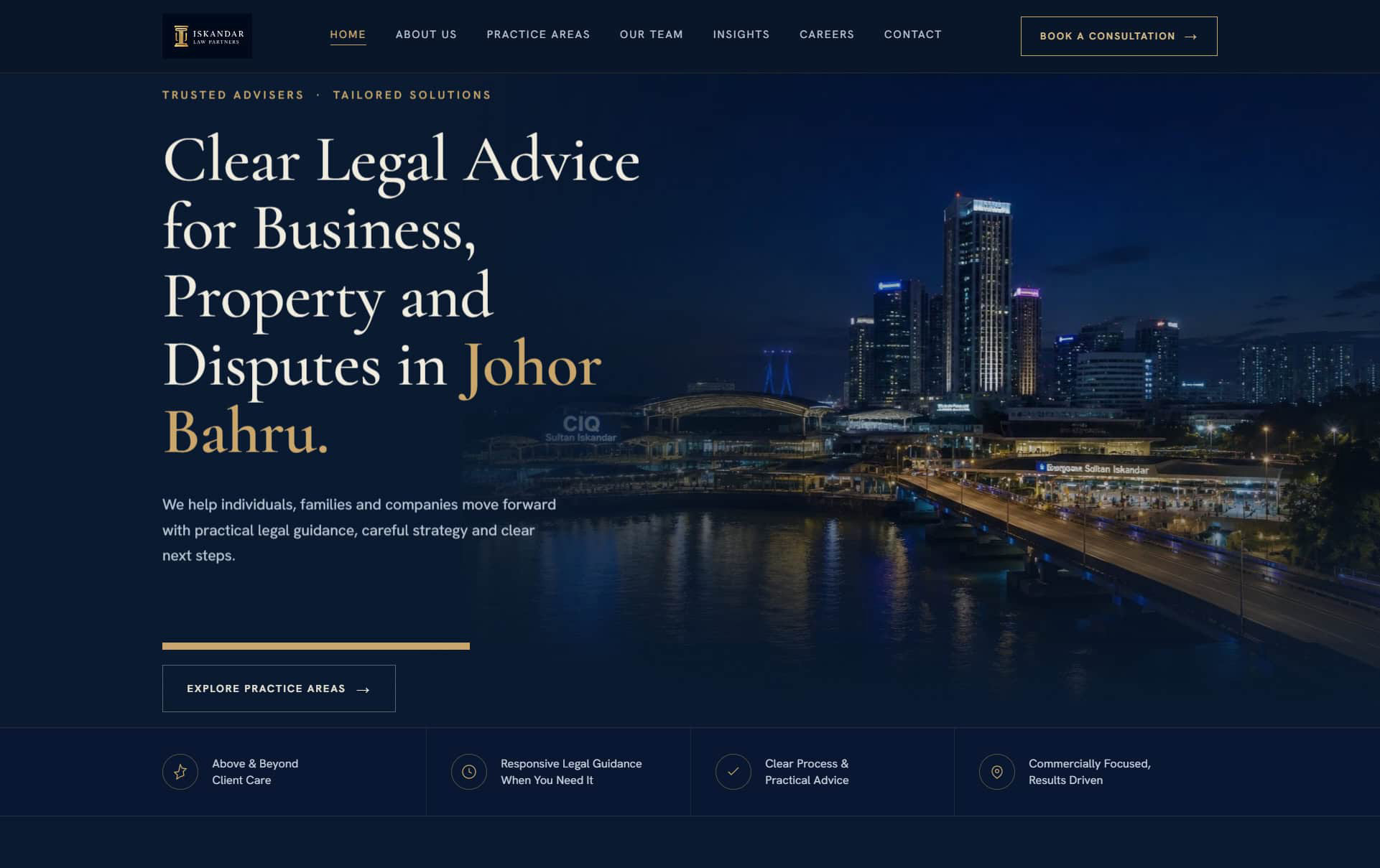
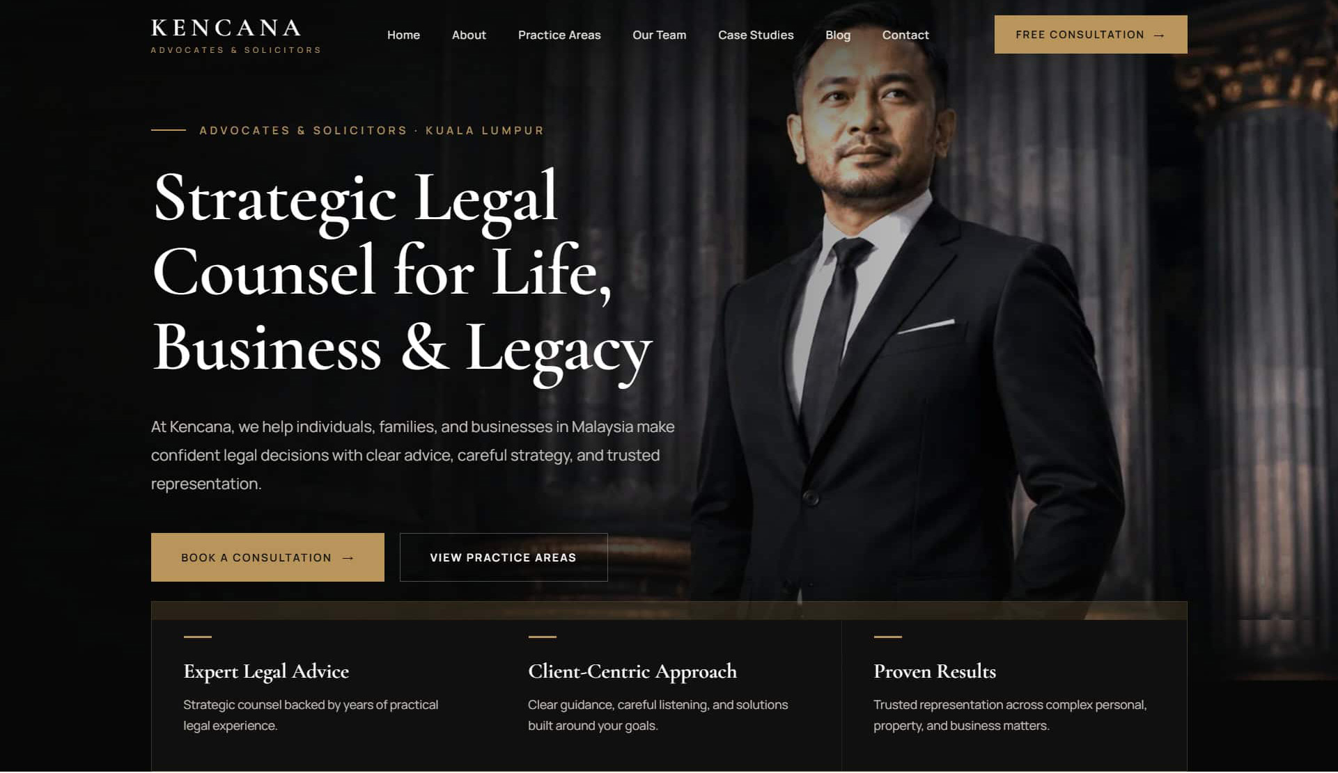
Kencana: premium authority for business, property, and legacy matters.
View live site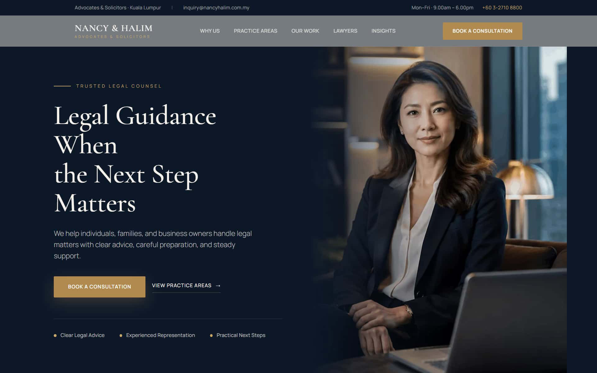
Nancy & Halim: calmer guidance for clients who need the next step made simple.
View live site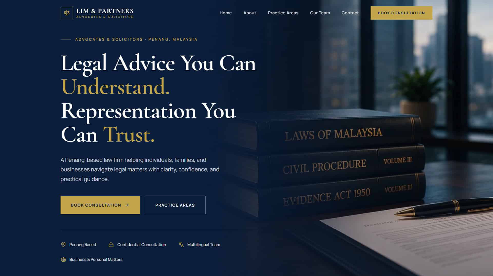
Lim & Partners: approachable legal guidance with warm credibility and clear consultation paths.
View live siteBuilt for conversion
The difference is not just visual polish. It is whether the visitor can move from uncertainty to confidence without getting lost.
The framework
A strong law firm website does not need to say everything at once. It needs to answer the right questions in the right order.
The visitor sees their situation reflected clearly and knows they are in the right place.
Experience, lawyers, practice focus, and proof reduce hesitation.
Practice areas become easier to scan, compare, and understand.
Visitors know what happens after they enquire and why starting is safe.
The contact step is visible, direct, and written in a way that feels calm.
How the review works
No jargon. No hard sell. Just a practical look at what may be stopping serious potential clients from contacting your firm.
Share the link and what kind of enquiries you want more of.
I check clarity, trust, mobile flow, search basics, and the enquiry path.
You get practical first fixes: what matters now and what can wait.
Use the advice yourself or ask me to help. There is no obligation.
Questions law firms ask
Straight answers about the review, redesign work, and what happens next.
Free first look
Send your law firm website and I will point out the first fixes to make it clearer, more trusted, and easier to contact.